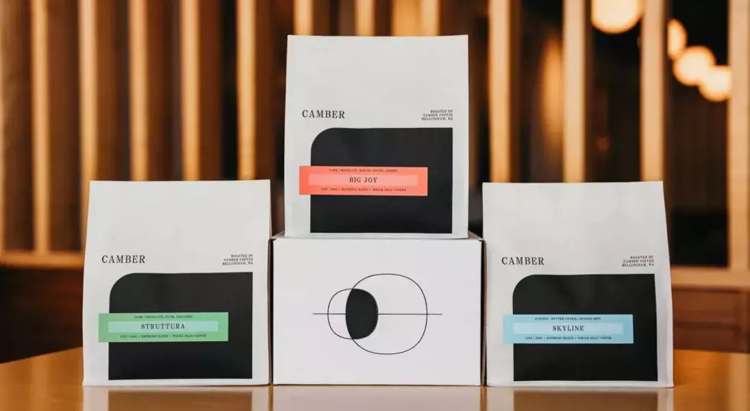
Camber Coffee, a renowned coffee brand hailing from Bellingham, Washington, has recently introduced a significant refresh of its brand identity, marked by new packaging. This strategic overhaul coincides with the company's decade-long milestone, reflecting a thoughtful evolution in its visual storytelling. The redesigned packaging seeks to harmoniously blend contemporary aesthetics with the brand's foundational inspirations, aiming to present its diverse coffee offerings in a manner that is both sophisticated and informative.
This comprehensive redesign is not merely a superficial update but a deeply considered effort to refine Camber Coffee's market presence. The new visual language and tactile experience of the packaging are intended to reinforce the brand's core philosophy: to let the intrinsic quality and complex profiles of its meticulously sourced and roasted coffees speak for themselves. Through this refreshed presentation, Camber Coffee continues its commitment to both aesthetic appeal and consumer engagement, ensuring that every package tells a part of its unique story.
The Evolution of Camber Coffee's Visual Identity
Celebrating its ten-year journey, Camber Coffee has launched a sophisticated packaging redesign, reflecting a commitment to sleekness, balance, and refinement. This extensive project, spanning more than a year, was driven by the desire to allow the inherent complexity of their coffee to truly distinguish itself. The updated design elegantly integrates the foundational concept of “camber”—a direct nod to the coffee's roast curve—while also subtly weaving in elements of their original celestial moon motifs. This careful integration ensures a forward-looking aesthetic that remains deeply connected to the brand's heritage and natural inspirations. The design also thoughtfully includes educational aspects, such as comprehensive tasting notes and detailed origin information for each coffee, thereby enriching the consumer experience.
The creative force behind Camber Coffee's striking new packaging is Cameron Jennings, a talented graphic designer based in Bellingham. His vision brought to life a design that is both contemporary and timeless, successfully bridging the brand's past and future. A particularly notable feature is the curved black element on the front of the bags, which directly references the 'curve' in the brand's name, symbolizing the roast curve process. This dark, bold shape provides a captivating contrast against the white backdrop of the bag, expertly balancing the asymmetrical logo and label to create a cohesive and strong visual anchor. The rear of the packaging features an intricate ornamentation of overlapping circles, meticulously crafted using the Golden Ratio. This motif beautifully conjures images of lunar phases or a celestial eclipse, gracefully integrating Camber's original moon imagery and its profound connection to the natural world. The color palette chosen for the labels further enhances the design, introducing warmth, vibrancy, and a balanced energy that vibrantly showcases the extensive range of blends and single-origin coffees that define Camber’s evolving selection.
Aligning Packaging with Brand Philosophy and Consumer Engagement
Camber Coffee's refreshed packaging masterfully embodies the company's overarching brand ethos and communication strategy. The brand's foundational principle has always been to meticulously select and roast exceptional coffees, allowing their unique characteristics to shine through with minimal interference. By adopting a streamlined and refined packaging aesthetic, Camber Coffee aims to convey that the quality of the coffee itself is paramount, effectively letting the product “speak for itself.” This minimalist approach ensures that the consumer's focus remains squarely on the superior taste and quality encapsulated within each bag, reinforcing the brand's dedication to purity and excellence in every cup. This design choice thus serves as a visual testament to their core values.
Beyond its aesthetic appeal, the new packaging serves a crucial educational function, deliberately designed to inform and engage consumers about the coffees they are enjoying. Each label for blend coffees prominently features detailed tasting notes, guiding consumers through the nuanced flavors and aromas they can expect. For single-origin offerings, the labels go a step further, providing comprehensive information about the coffee's origin, including its geographical location, specific varietal, the altitude at which it was grown, and the processing method employed. This transparency empowers consumers to make informed choices and deepens their appreciation for the coffee's unique journey from bean to cup. Furthermore, in an era of increasing environmental consciousness, Camber Coffee has made a commendable effort by utilizing Biotrē 2.0 plant-based materials for their 12oz bags, underscoring their commitment to sustainable practices, even as they navigate the current limitations regarding full recyclability or compostability for these specific materials.